JSON
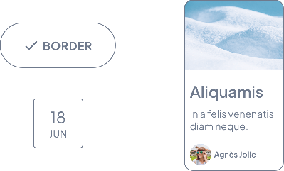
Here’s the JSON format of this object :
{
"color": COLOR OBJECT,
"size": INTEGER // Line width in pixels, default value is 1
}
Documentation
Default value
By default, the Atom Border value is 1px, but it can be customized in the JSON. It can also vary depending on the settings of the predefined themes.

Behavior
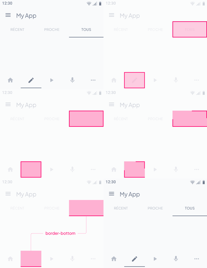
Some components can receive different contour sizes depending on their condition.
Below, the behavior of a Textfield going from an Inactive state to Active

Distribution
Certain components won’t be able to receive the Atom on their 4 sides

 Ontwerp